GRAPH-3680-4-2020FA
M/TR 4-7PM(PT)
Exhibition Design
This Course will focus on the activity of exhibition making – bringing together key components and distinct goals contained within such a pursuit: the curation of information and materials; the design of space and distinct relationships between elements; and the internality and externality of an exhibition in relation to the space it occupies. In response to the unprecedented impact of the COVID-19 virus, and its impact on education and arts spaces, the class will focus on these ideas in relation to our personal, public, and virtual spaces.
Together we will program and stage two series of exhibitions – one on a specific artist/designer, and another in collaboration with Letterform Archive. Additionally, we will address the exhibitionary apparatus that surrounds them which includes: programming events, circulating awareness of the effort, and other activities that highlight our activities as a class in a public and visible way.
For this semester our focus will be artists/designers who engage in, or support, issues of equity and self-preservation. Furthermore we will grapple with the unique challenges of exhibiting Graphic Design materials meant for circulation, and act on the opportunities such a task presents!
This class will be very team oriented, with the goal of leveraging your unique skills and approaches and backgrounds. As such, you will take on roles you may not have in the past – managing projects, curating, writing, and more! Practically, students will work in a small group for the duration of the semester to deliver two exhibitions (per group).
In addition to our time together during the semester, we will also document and circulate our activities. You will write, design, and produce a catalog for your exhibitions – either online and/or in print; and create a public program – lecture, workshop, and/or performance.
During this class we'll function as a distributed studio – actualizing your proposals as an entire class with different groups leading the initiative. You’ll be tasked with being independent and managing your own time – working with artists, institutions, and outside vendors, and presenting your group’s work to the rest of the class to get feedback and push your projects further.
In summary the semester will explore the dual idea of creating a narrative for a particular artist/designer/studio and considering how to visually present it within an exhibition context.
Fall Exhibition Series
As an ongoing project this semester, we’ll curate, design, and promote a series of ‘distributed’ exhibitions.
For this semester we’ve confirmed 3 designers/artists with unique approaches to Graphic Design whose work will serve as the semester subjects. They are: Hardworking Goodlooking, Amy Suo Wu, and Danielle Aubert.
As small groups of ~4, each group will work with one of these subjects to define their shows concept, works, and title. You will then design the ‘space’ and identity for the show, build and ‘install’ the exhibition (coding, uploading; printing and mailing; fabricating and installing; and otherwise distributing content), promote the exhibition, create a public event, and catalog all of the above.
Although our exhibitions are ‘distributed’, this doesn’t mean your exhibition needs to recreate a physical gallery in an online virtual space (although they can if you’d like). Consider how the show could take shape as unconventional formats such as:
- an email newsletter
- a series of PDFs uploaded to Google Drive
- an archive of ‘objects’ represented by images
- files for 3d printing
- wheat pasted graphics around town
- a scavenger hunt
- etc.
Due to the current health circumstances we will reconsider how exhibitions are experienced – be it in the virtual space of a browser window, or a multitude of ‘real world’ contexts. For instance, do you ask the viewer to assemble the show via mailed printouts in their own spaces? Arrange browser windows on their laptop screens in a unique configuration? Or do you think of the inverse and broadcast a video of an intentionally arranged physical space to have more control over its viewing?
You will have limited access to your subject – at minimum to one interview (synchronously or asynchronous), and communications to transmit files to be exhibited. As such, you will need to do a lot of preparation before speaking to your subject in order to make that exchange as fruitful as possible.
Each group will be responsible for the following:
Distributed Exhibition
- Display of work in the exhibition
- “Wall Text” (your Mission statement)
- “Brochure” (should include an interview or some kind of contextual information)
- Publicity (digital poster)
- Programming
- Documentation
Each group will produce a catalog via, Blurb, Lulu or some other on demand service or alternatively screen-based documentation (a website). As you work think about documentation that could end up in your catalog (or if these are one in the same).
All exhibitions will launch on November 30, two weeks before class ends, and documentation will be due at the end of the semester by December 14.
Due to the shift to online learning, we’ll need to be flexible and creative in our collaborations. As a result, you will need to be organized, and self-sufficient at moving your work forward in a manner that ensures its success.
Exhibition Subjects
Amy Suo Wu
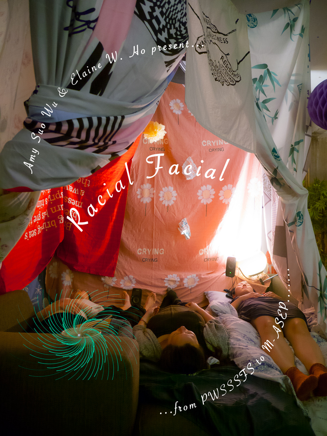
Amy Suo Wu was born in China, grew up in Australia, and lives in The Netherlands as an artist, designer and teacher. Since 2015, she has engaged in steganographic practices such as hiding techniques, evasion tactics, and covert communication as acts of protection, survival and resistance in the face of oppression and violence. This research is now published under the title 'A Cookbook of Invisible Writing' through Onomatopee. Her most recent interest and practice circles around literal and metaphorical approaches of mending, design as remittance and self-fulfilling prophecy and how text and textile might be woven together to form embodied publishing.
Wu has co-organised the annual zine festival Zine Camp in Rotterdam between 2014-2019. From 2013-2016, she co-ran Eyesberg, a graphic design studio motivated by conceptual and experimental approaches. She was awarded the Grant programme for Talent Development from Creative Industries Fund NL, as well as two studio residences at I: project space in Beijing and ZKU in Berlin. Recent solo and group exhibitions have been held at Artspace Ideas Platform, Sydney; Drugo More, Croatia; Aksioma – Institute for Contemporary Art, Ljubljana; Seoul Mediacity Biennale; Espace Multimédia Gantner, France; and I: project space Beijing. She is currently a tutor and graduation supervisor at Experimental Publishing at Piet Zwart Institute and practice teacher in Cultural Diversity at Willem de Kooning Academy, Rotterdam.
Danielle Aubert
Danielle Aubert is a graphic designer whose work examines materials, methods of production, machines and labor. She is the author of Marking the Dispossessed (2015: Passenger Books) and 16 Months Worth of Drawings in Microsoft Excel (2006: Various Projects). She is co-author, with Lana Cavar and Natasha Chandani, of Thanks for the View, Mr. Mies (2012: Metropolis Books). She is an Associate Professor of Graphic Design at Wayne State University, in Detroit. From 2013-15 she was a Fellow in the Creative and Performing Art at the Lewis Center for the Arts at Princeton University.
Danielle Aubert holds a BA in English Literature from the University of Virginia and an MFA in graphic design from Yale University. She practiced graphic design in New York and Moscow before returning to graduate school. In 2005 she moved to Detroit, where she served on the board of the AIGA, taught at the College for Creative Studies, and started her own practice before joining the department of Art and Art History at Wayne State University in 2008.
In 2009, she and Lana Cavar co-founded the International Typographical Union. Together with Maia Asshaq, they made a series of projects that explored paper distribution and after-market paper, and presented work in various venues including the School of Art Institute of Chicago, the Palais de Tokyo in Paris and Motto in Berlin. Also in 2009, Aubert, Cavar and Natasha Chandani launched the group Placement, which edited, wrote for and designed Thanks for the View, Mr. Mies, about life in Lafayette Park, a residential district in Detroit designed by Mies van der Rohe. In 2014, Chandani and Aubert worked with AIGA/NY on a post Hurricane Sandy design project in Rockaway, Queens. In 2015, Cavar, Chandani and Aubert changed the name of their group from Placement to CLANADA.
From 2008–2017, Aubert designed the quarterly journal Criticism, which in 2012 was selected to be a part of the 25th Brno Biennial of Graphic Design in the Czech Republic. She has designed publications and print material for many clients in the arts and academia.
In 2015 she published the artist book, Marking the Dispossessed, that collected all the reader's notes, underlines, and marks found in 100 used copies of Ursula K. Le Guin's 1976 novel, The Dispossessed.
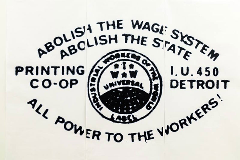
She is currently researching the print work of Fredy Perlman and the Detroit Printing Co-op, a facility that existed in the 1970s and printed many radical left publications.
Hardworking Goodlooking
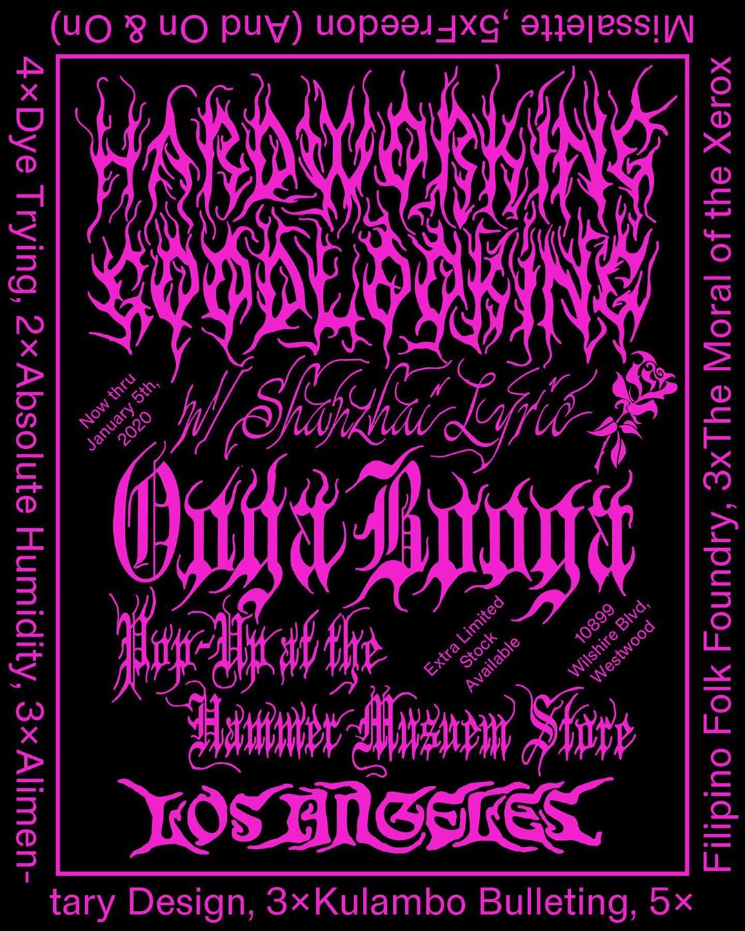
(HWGL) is a publishing and graphic design hauz founded in 2013. HWGL generates, prints, and disseminates cultural publications (most of the time) out of the Philippines. HWGL is interested in decolonization of cultural labor, parlance in the vernacular, and the value of what has been invisible. Their publications on cultural topics are printed in very, very small cottage-industry presses and copy shops in the Philippines. HWGL was incubated as a project of the social practice platform The Office of Culture and Design (2010—2018). HWGL works out of Laguna (PH), Rotterdam (NL), Portland (USA), and Brooklyn (USA).
Tabletops Exhibitions
This semester we will create ‘tabletop’ exhibitions, with works from the Letterform Archive in collaboration with Kate Long, Librarian at LFA. We will materialize these shows in two ways: via the new ‘tables’ feature on their digital web archive; and as a printed takeaway that can be circulated by mail and entered into Letterform Archive's collection.
Each group will be responsible for the following:
- One tabletop exhibition consisting of 2 or more objects manifested on Letterform Archive's Online Archive and in print for distribution (via the mail)
- Label text for each object
- A mission statement
- 11 ✕ 17 inch ratio poster promoting the show
- Digital graphics to promote your show on LFA's website
While there are 5 (arguably 6) deliverables per show, some deliverables can perform multiple functions. For instance, the printed version of your show can be a single paper, that acts as your promotional poster, label text, and the show itself. However, these decisions should be in service of making the show as compelling as possible and not just to save time.
These exhibitions must be in dialog with the rest of the course’s content – they can respond directly to the subject your group is working with, or to the broader subject matter of the exhibition series. Your show’s topic is open – however, you must be able to articulate how your show fits into the larger framework of the course. Some topics to be considered are: the history of graphic dissent; design for evasion and self-preservation; and graphics in propaganda and political movements.
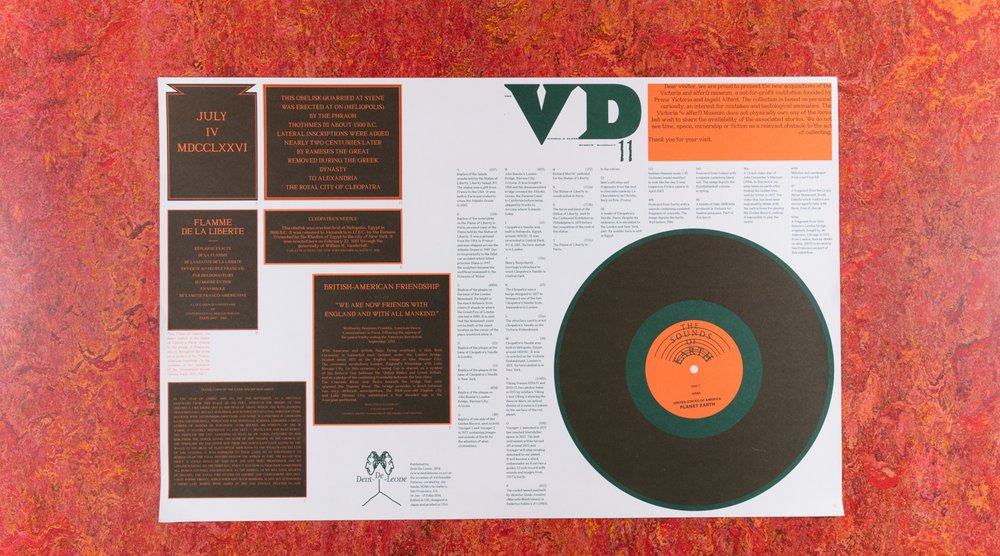
Victoria and alFerd Museum No. 11, Åbäke
When conceptualizing and actualizing your exhibition, pay special attention to your roles as curator, and writer. How does the arrangement / representation of your items extend their narrative and the viewers understanding of them? How do your chosen artifacts in conjunction with your writing – of a mission statement, and label text – triangulate to tell a rich story
Furthermore How does the 'tabletop' format privilege certain objects, and viewing experiences? How does this relationship change since there is no dedicated physical tabletop for us to use? Given our shelter-in-place moment, how can the show represent, and embody itself beyond the screen? Can you distribute instructions for creating a spatial experience in ones home? Do you use 3d renderings and photoshop to imagine a speculative gallery in which the tabletop lives? Does your exhibition fold into a voluminous object?
We will have organized check-ins with Kate from Letterform Archive, however the project will require you to do independent research – reaching out to Letterform Archive on your own to arrange additional meetings. Kate has generously volunteered to meet with you at your request, but you must be timely and proactive. Do not let this opportunity go to waste!
Schedule
Week 01: 08.31 - 09.05
Kickoff Tabletop Exhibition Project
Week 02: 09.06 - 09.12
Sync up with Kate from LFA
Week 06: 10.04 - 10.10
Present Tabletop Exhibition Concepts
Week 09: 10.25 - 10.31
Launch 'Tabletop' Shows with LFA*
*Table is created on LFA's website, print exhibition is in the mail, promotions posted online
Letterform Archive
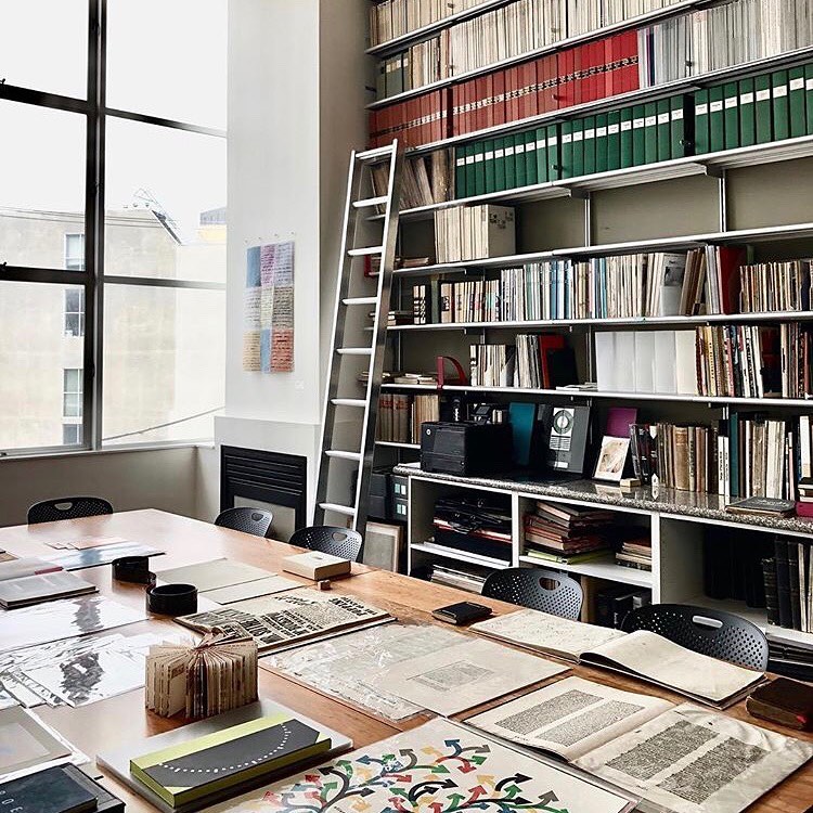
So far, the Archive has welcomed over 10,000 visitors from 30 countries, including students, practitioners, and letterform admirers from every creative background. Some come with specific research ideas in mind, while others are simply looking for inspiration. Invariably, thanks to the breadth and accessibility of the collection, they stumble on something unexpected. Serendipity is key to the Archive experience.
In addition to hosting visits and public events, the Archive serves a global community through social media, state-of-the-art photography, and publications. We offer courses and workshops in type design, calligraphy, and typography. We also curate exhibitions of our holdings, organize lectures by visiting artists and designers, and host salons and receptions to showcase collections or celebrate out-of-town guests.
The Archive is located on Ramaytush Ohlone land in the Dogpatch neighborhood of San Francisco.
Kate Long
Kate Long has a profound interest in book arts, typography, and concrete poetry, stemming from high school where she made art with abandoned Letraset, and later as the editor of a literary magazine where she enjoyed working with designers, artists, and writers. She also gained an appreciation for 20th-century graphic design while at the award-winning studio, Office. Kate earned her MLIS through Drexel University, which will serve her well as she helps to preserve and catalog the collection. She relishes helping people access the things that interest them.
Schedule
Week 01: 08.31 - 09.05
Kickoff Projects
Form Groups / Select Subjects
Week 02: 09.06 - 09.12
Week 03: 09.13 - 09.19
Week 04: 09.20 - 09.26
Present Exhibition Concepts
Week 05: 09.27 - 10.03
Week 06: 10.04 - 10.10
Present Tabletop Exhibition Concepts
Week 07: 10.11 - 10.17
Present Exhibition Visualizations
Week 08: 10.18 - 10.24
Week 09: 10.25 - 10.31
Launch 'Tabletop' Shows with LFA
Week 10: 11.01 - 11.07
Present Final Exhibition Proposal with Graphic Identity
Week 11: 11.08 - 11.14
Week 12: 11.15 - 11.21
Week 13: 11.22 - 11.28
Week 14: 11.29 - 12.05
Launch 'Distributed' Exhibitions
Week 15: 12.06 - 12.12
Week 16: 12.13 - 12.15
Submit Documentation/Catalog
Colophon
Exhibition Design
California College of the Arts
Fall 2020
M/TR
4-7pm
Online
The Class
- chris hamamoto
- Menaja Ganesh
- Chiao Huang
- Howsem Huang
- Jennifer Jang
- Aashi Jhaveri
- Ji Yun Kim
- Karina Kristensen
- Amanda Lee
- Yixun Li
- Cherry Ling
- Ruiyi Liu
- Eileen Loera
- Darian Newman
- Soyeon Park
Collaborators
- Amy Suo Wu
- Danielle Aubert
- Jon Sueda
- Kate Long / Letterform Archive
- Omar Mohammad
- Rachel Berger
Typefaces
- San Francisco Rounded
- San Francisco Mono